Ultimate Modern Farmhouse Kitchen Tour You’ll Love
July 7, 2020
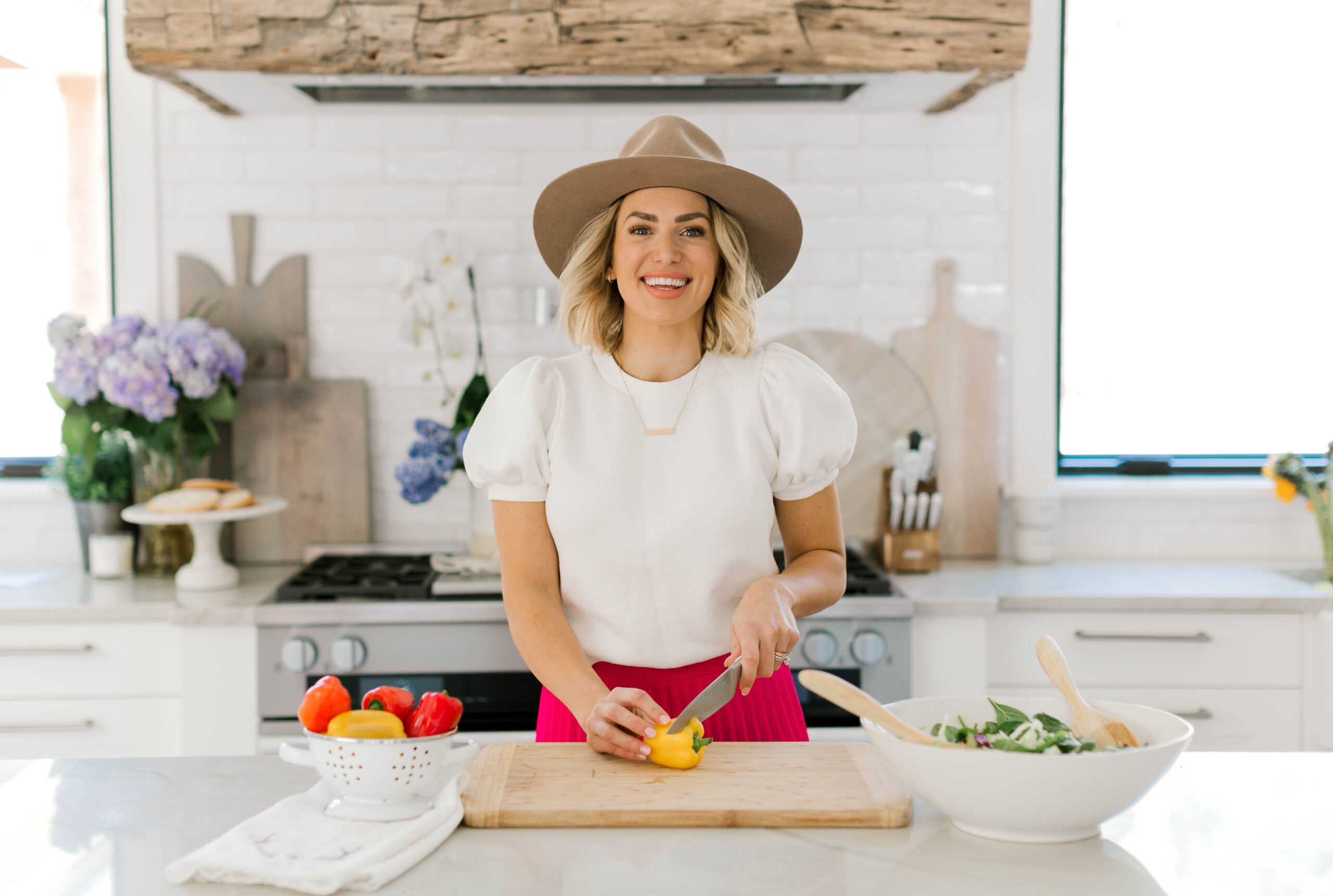
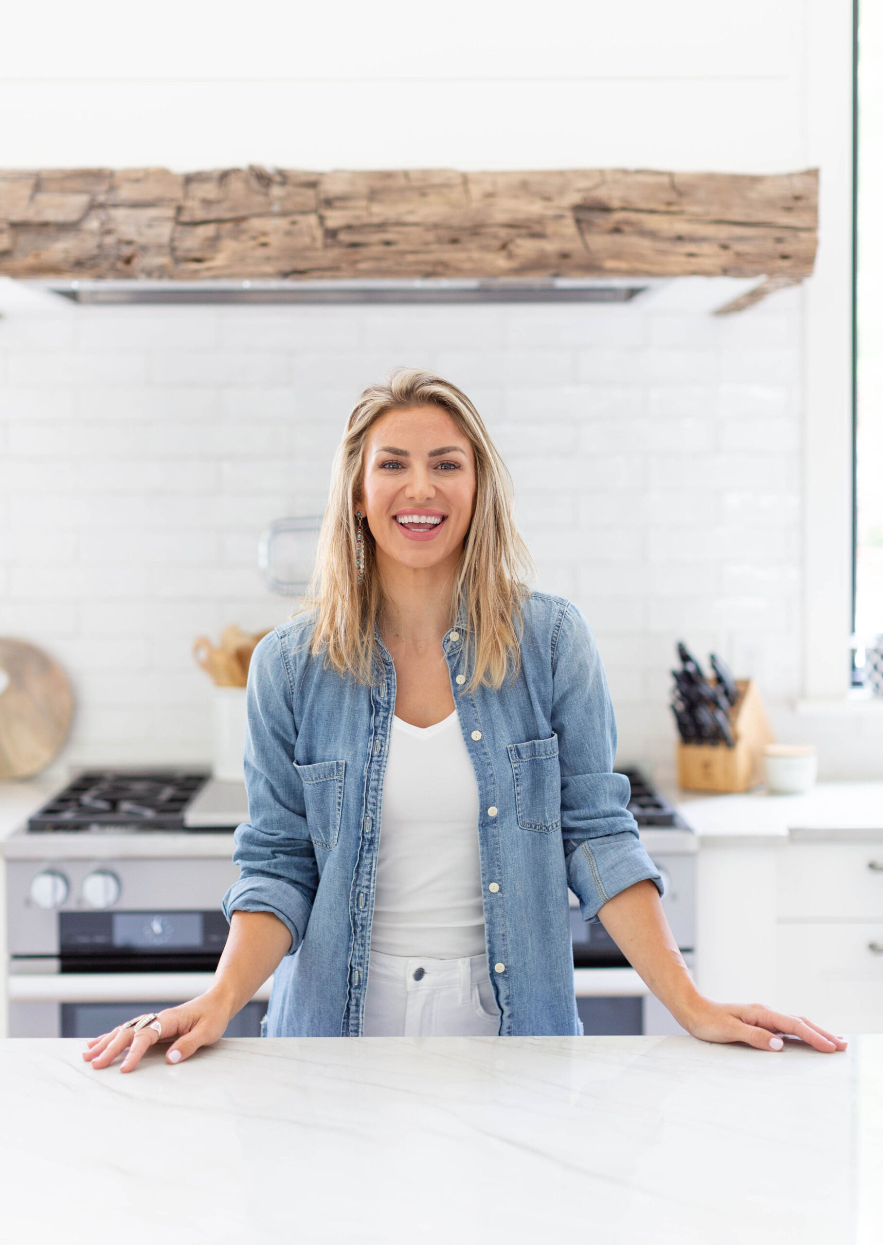
Welcome, welcome, WELCOME to what I consider the headquarters of our home: the kitchen. This is where my modern farmhouse dreams truly became a reality. Every detail in this space was reallllly curated (hah, ask Tim!), because I wanted this room to anchor the rest of the house.
Ultimately, this kitchen is about so much more than design. It’s where we gather to pray, cook, visit, talk about our days, and share meals with family and friends. It’s light, airy, open, and welcoming…there’s always space at our table.
So pour yourself a coffee (or a glass of wine) and settle in, because this is a LONG one. I’m finally ready to give you the full tour of my dream modern farmhouse kitchen.
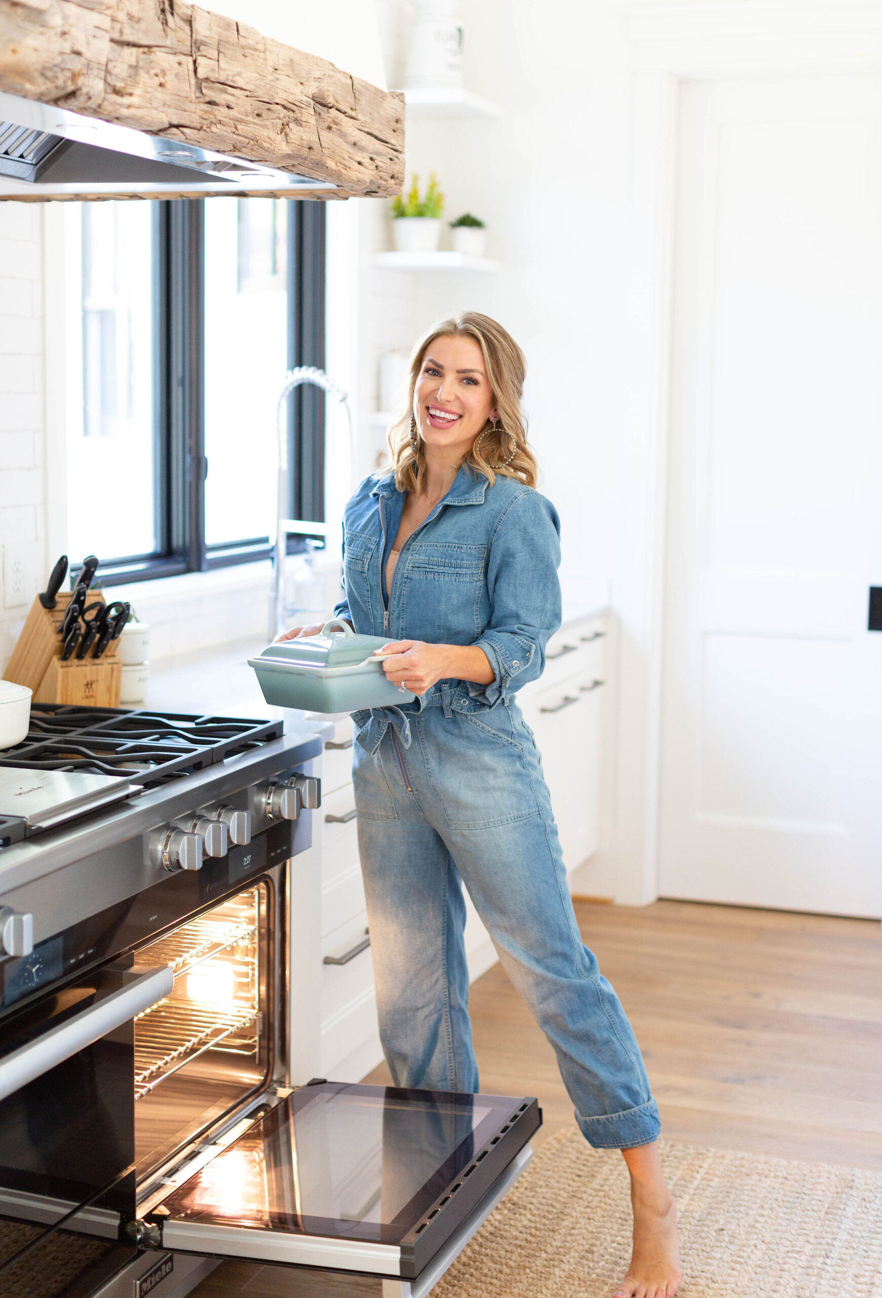

Kitchen Appliances That Work as Beautifully as They Look
All of our major kitchen appliances are from Miele, and aside from the fact that their aesthetic A-game is always on point, they are hands-down the smartest appliances I’ve ever owned.
For example, Miele ovens are designed with the environment in mind. They actually turn off early and allow residual heat to finish cooking your food—saving energy without sacrificing quality. In addition, I love cooking with gas because the heat is easy to control and food turns out amazing without much effort.
Better yet, many of the settings are incredibly intuitive. The oven even has pre-loaded recipes and knows exactly how long to cook your meal for. Umm… yes please.
The 10-Foot Kitchen Island That Does It All
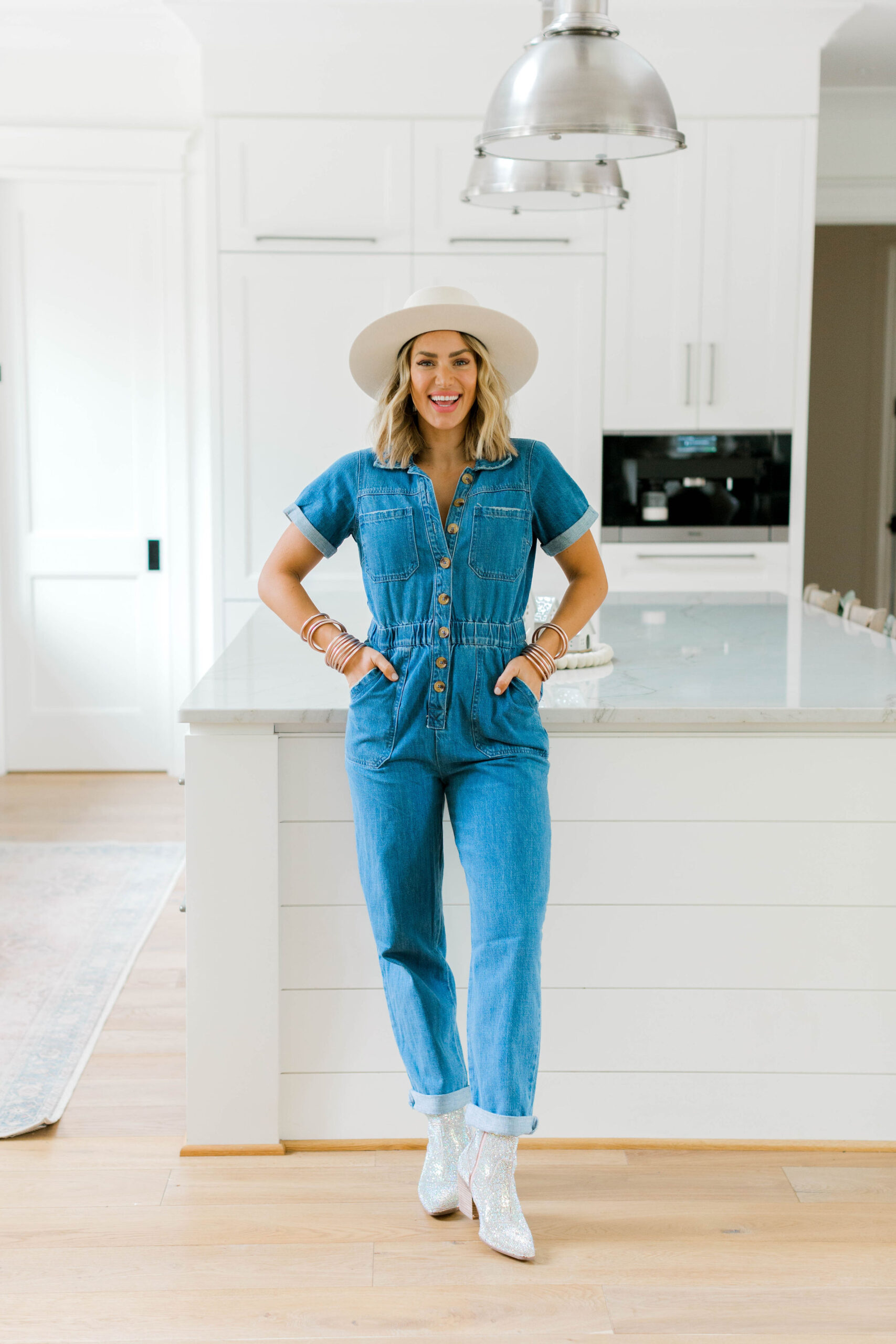
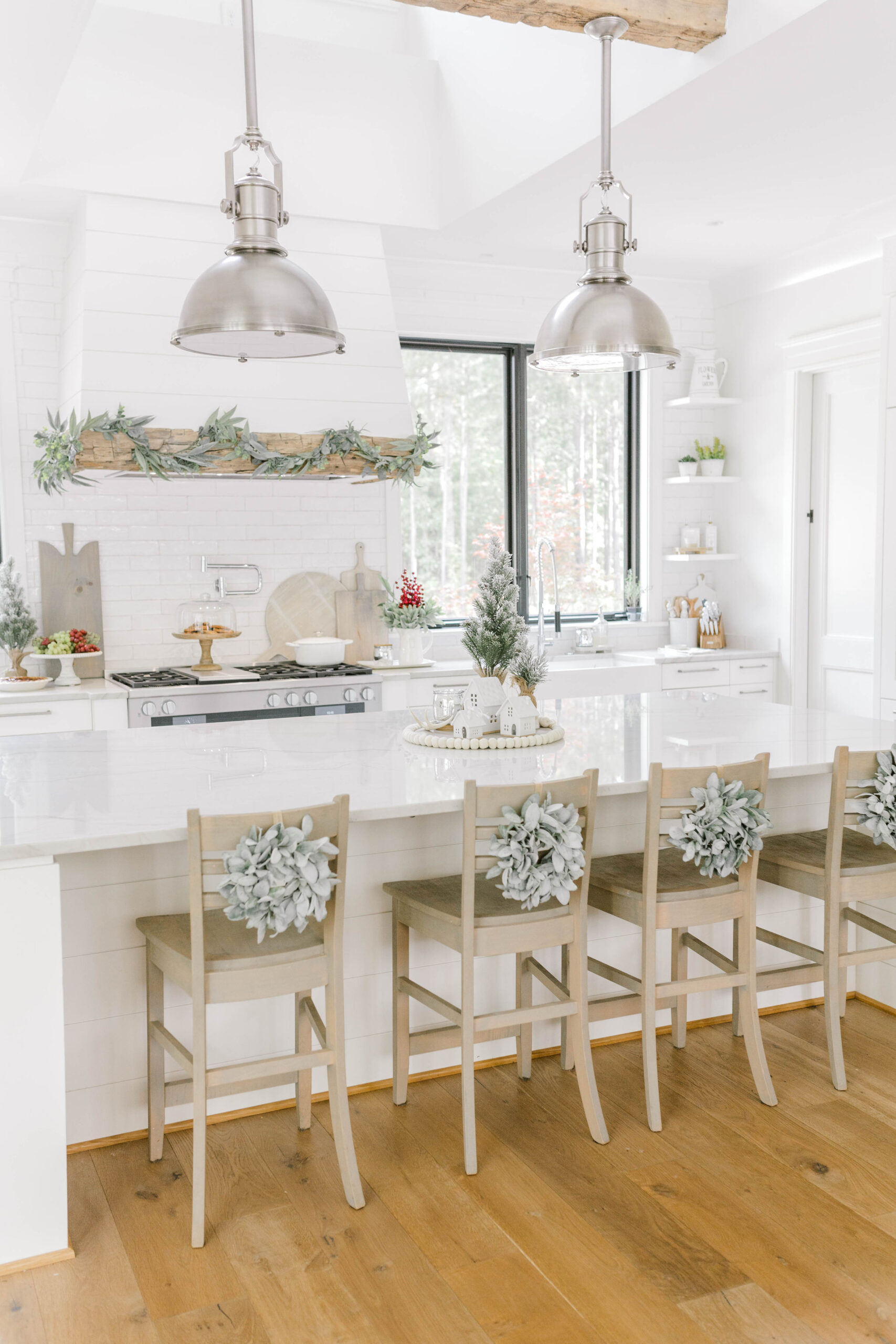
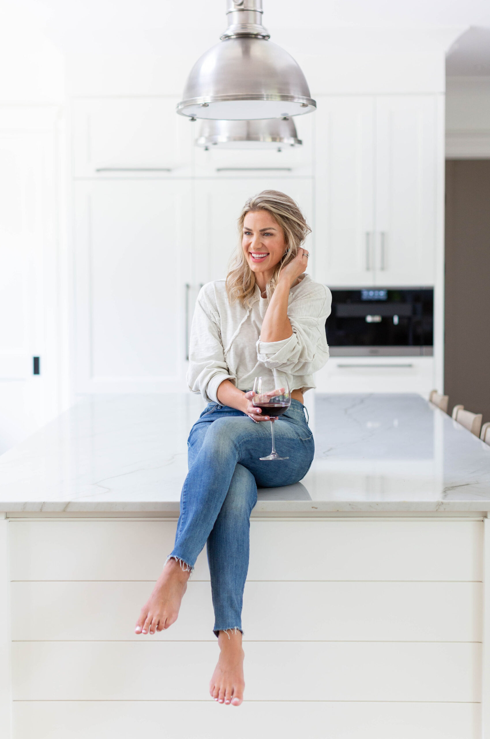
Our giant kitchen island is a serious show-stopper. It’s 10 feet long and 5 feet wide, which means it can basically fit an entire hockey team. However, one of the most intentional design choices was leaving the island sink-free. I purposely placed the sink by the window so the island could stay completely open. Because we often do buffet-style meals, I wanted one long “runway” where food could be lined up without working around a sink or stove.
As a result, this island has become the most functional and most used space in our home.
Custom Barstools with a Whole Lot of Heart
The wooden barstools from Simply Amish are straight-up dreamy. My aunt Cindy (who designs Modern Farmhouse Furniture and offers design services), helped me customize these pieces, and they turned out perfectly.
We chose the Pasadena stools in a custom color that has since been named the “Eva Sand Dune” stain. Every piece is handcrafted in the Heartland of America, which I absolutely love.
Honestly, having these thoughtful, one-of-a-kind touches makes me appreciate our home even more because I know how much love went into creating it. Thank you, Cindy and the Simply Amish team!
Statement Lighting & Reclaimed Wood Details
Our pendant lights over the island are from Circa Lighting, and I already told Tim that if we ever sell this house… those pendants are coming with me.
At the last minute, we decided to add a floating reclaimed wood beam from Appalachian Antique Hardwoods above the island to suspend the pendants. Meanwhile, that decision turned into one of the most commented-on features in the entire home.
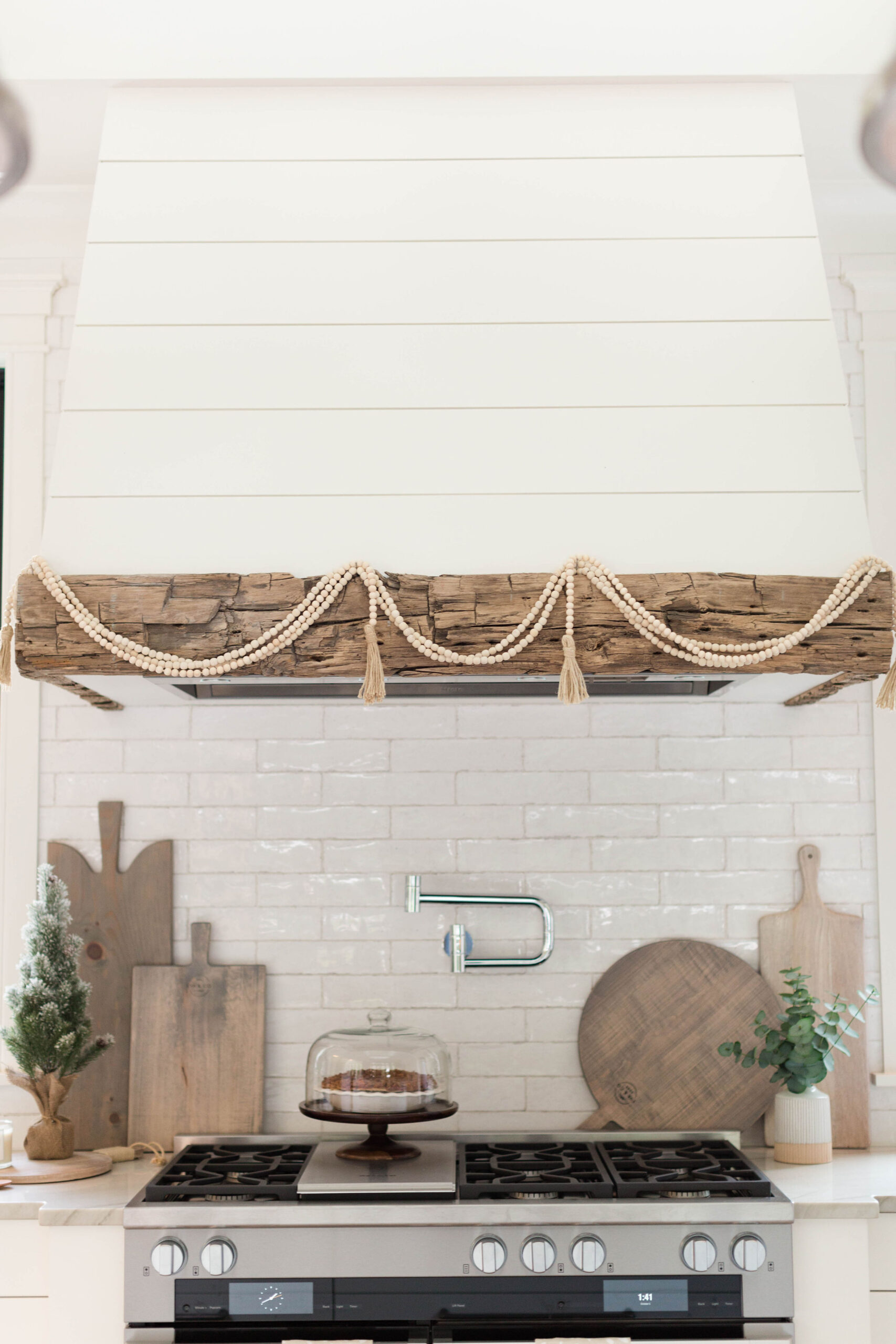
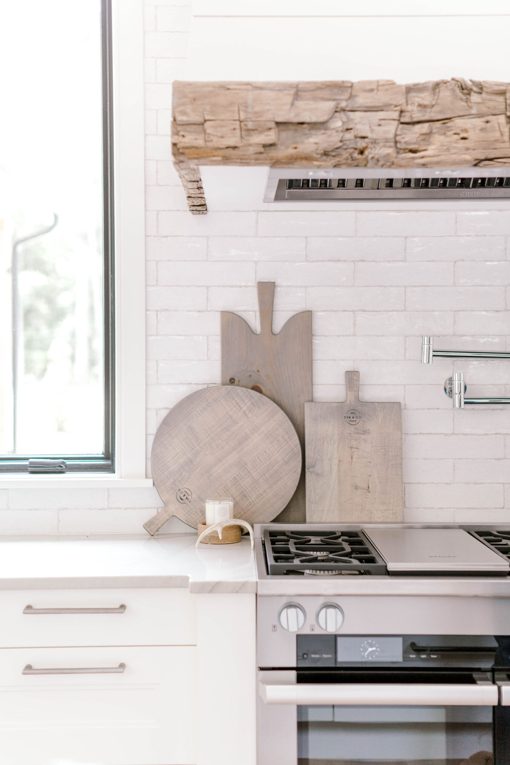
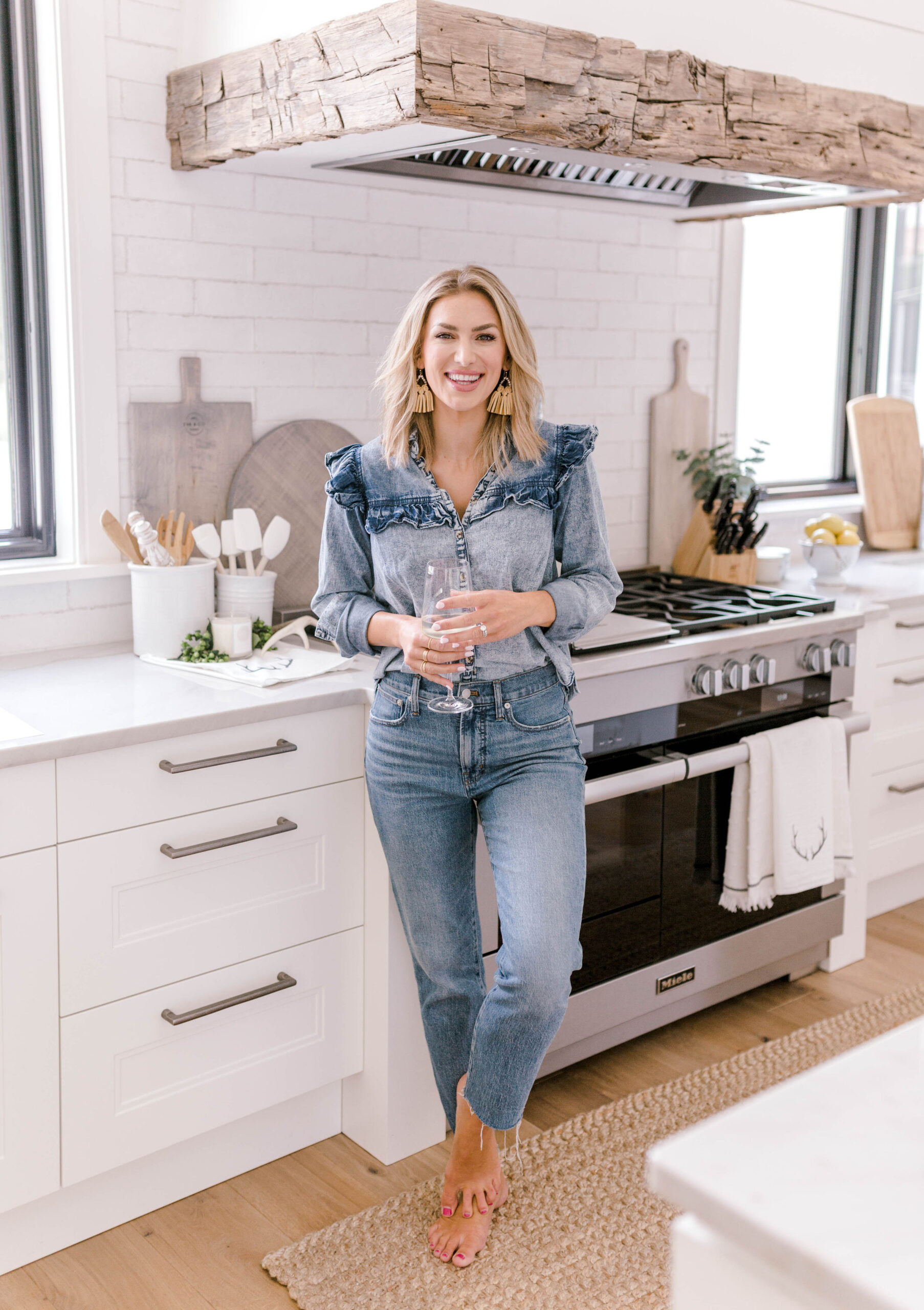
Just above the Miele stove, you’ll see another reclaimed wood feature wrapping the vent hood. Every single time I walk by it, I’m thankful we made that choice.
Pairing reclaimed barn wood with shiplap from Metrie, painted Alabaster by Sherwin-Williams, adds warmth and texture while still keeping that clean, modern farmhouse feel. It’s rustic, timeless, and makes me genuinely happy every day, which, to me, is what good design is all about.
Tile, Hardware & the “Happy Accident” That I Now Love
All of our tile and ceramics, including the rustic subway tile backsplash, were sourced from Triangle Tile and Stone. I wanted something clean and bright, but still full of character, and I fell in love immediately.
They have all of our exact selections on file, so if you’re trying to recreate this look, just reach out to them (ask for Ashton!).
Now… let’s talk about drawer pulls.
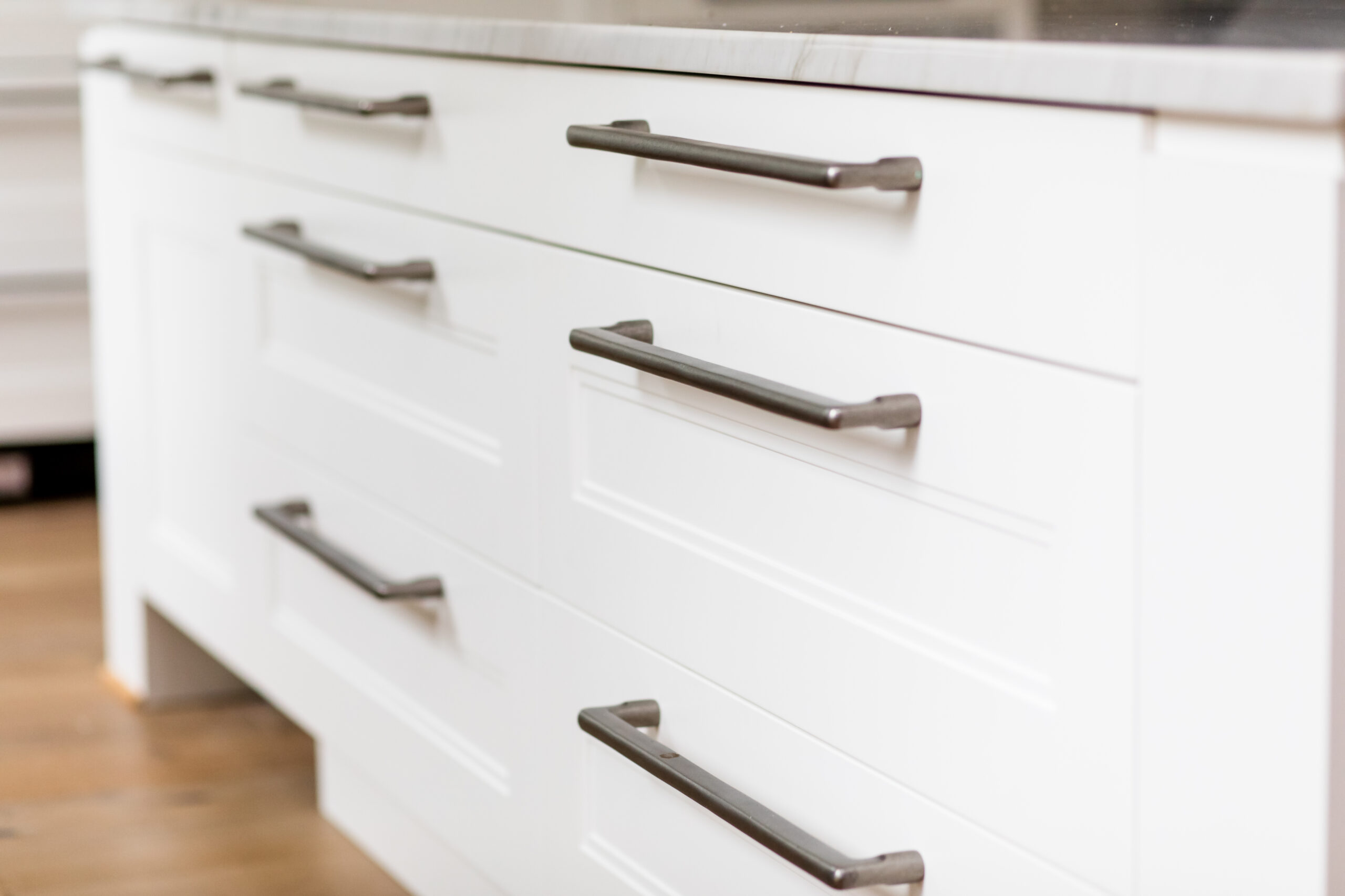
Is it weird to be in awe of drawer hardware? Because I am genuinely obsessed with these TopKnobs pulls. Funny enough, I accidentally ordered appliance pulls instead of standard drawer pulls—and when I first saw them installed, I about cried from stress.
But after living with them? I LOVE them. They’re chunky, heavy, incredibly durable, and can absolutely withstand a toddler using them as a personal jungle gym (I see you, Boone).
Sometimes design “mistakes” turn into your favorite elements, and this is one of those times.
Mont Blanc Quartzite Countertops
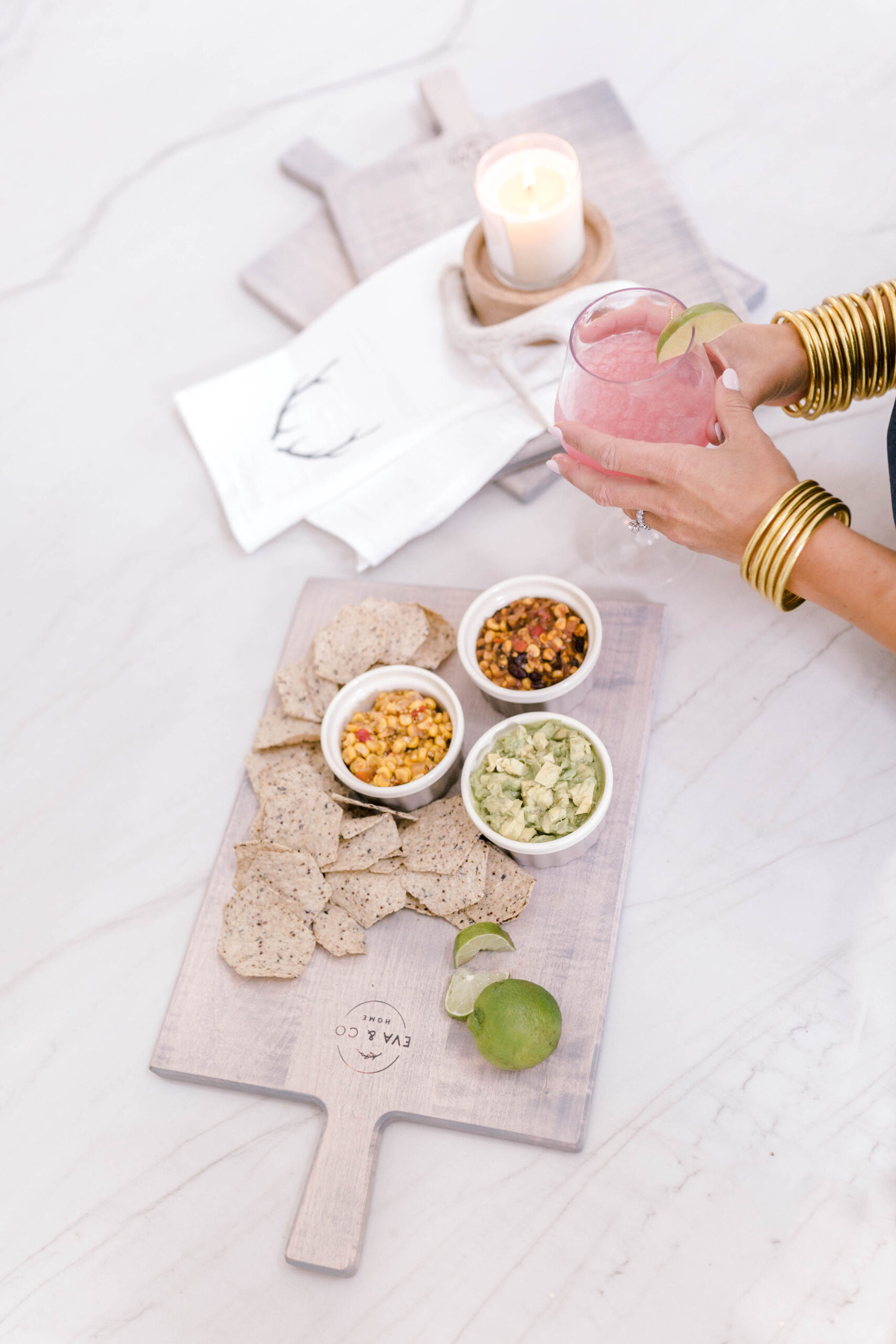
One of the most beautiful features in this kitchen is the Mont Blanc Quartzite countertops we sourced locally in Raleigh.
We debated quartz versus natural stone, but ultimately decided on real stone for durability and character. Finding slabs large enough and light enough for our massive island wasn’t easy, but Mont Blanc Quartzite ended up being the perfect balance of light, dark, durability, and movement.
I’m completely obsessed.
A Hidden Fridge, Coffee Heaven & Clean Lines
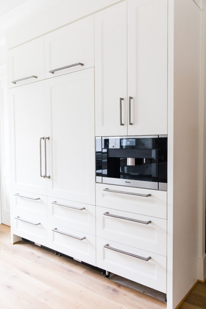
Can you spot the fridge? That’s because it’s fully paneled and integrated beside our Miele coffee maker.
Even though I wasn’t trying to hide it, I love how clean and uniform everything looks. At the end of the day, I can get this kitchen back to feeling calm and organized which my brain deeply appreciates.
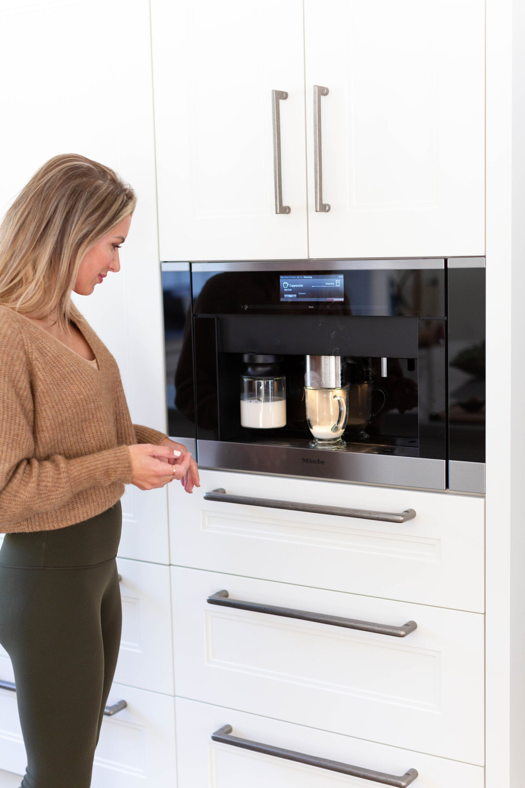
Also, Tim’s favorite feature in the entire house? The Miele coffee maker. Worth every penny. Coffee heaven.
Natural Light, Open Shelving & Bold Windows
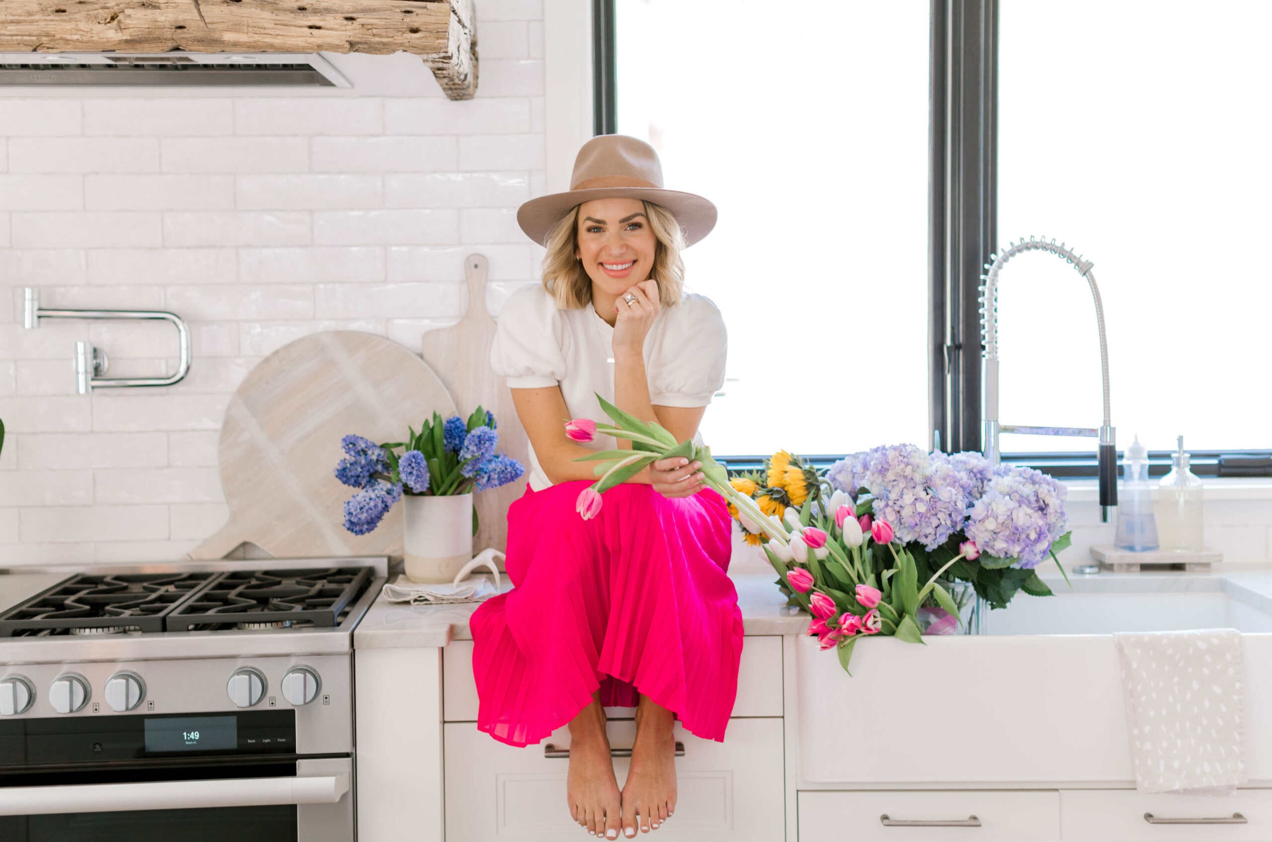
Standing at the sink is infinitely better when I’m looking out of two 5-foot-wide windows. I skipped upper cabinets on this wall entirely to maximize natural light, and although I got some strange looks at first, I couldn’t be happier with how it turned out.
We used Pella windows throughout the home, painted black inside and out, and they make such a bold statement. I also added floating shelves to both corners of the kitchen for decor and warmth.
Love, love, love.
All of our kitchen fixtures came from Rick Jacobs Fine Plumbing and Hardware, and Rick was truly incredible to work with. He helped us choose Dornbracht fixtures for sinks, showers, and tubs throughout the house, including this beautiful farmhouse sink.
If you want our exact selections, I highly recommend reaching out to him.
Moving, Memories & Gratitude
Many of these items were shipped to our old house while we waited for the build to finish, and I was honestly sweating about everything arriving safely.
Thankfully, Two Men & A Truck handled the move, packed everything perfectly, and not a single thing broke. With a newborn at the time, that kind of care meant the world to me.
This kitchen is where I start and end every day, coffee in the morning, wine at night, thanking God for this life and all these blessings.
Did I miss anything? Drop your questions in the comments, and I’ll see you back here soon for more of the good stuff
VENDOR RECAP
Kitchen Appliances: Miele – 48″ Dual Fuel gas range, 30″ Refrigeration Towers, Wall oven, 36″ Fridge/Freezer in Skullery, 2 Dishwashers
Windows: Pella Windows
Hardware: TopKnobs – Drawer pulls in Aspen Flat Sided/Silicone Bronze Light
Hardwoods: Appalachian Antique Hardwoods – Range hood accent
Barstools: Simply Amish
Backsplash: Triangle Tile & Stone
Paint: Sherwin Williams – Alabaster
Flooring: Hallmark Floors – Alta Vista “Malibu”
Shiplap: Metrie
Moving Services: Two Men and a Truck
Lighting: Circa Lighting – Country Industrial Large Pendant in Antique Nickel and Darlana Large Linear Lantern in Aged Iron
Kitchen Hardware: Rick Jacobs Fine Plumbing
Designer: David Glover Design – the best kitchen floor-plan to fit our needs
Want even more home design inspiration?
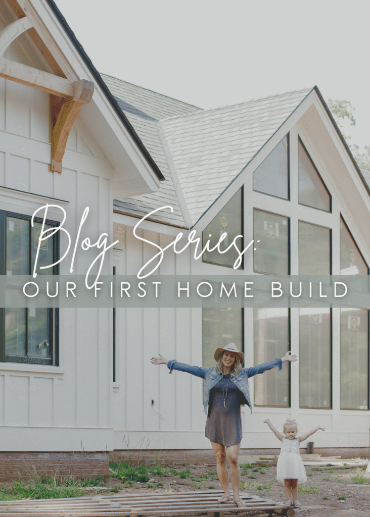
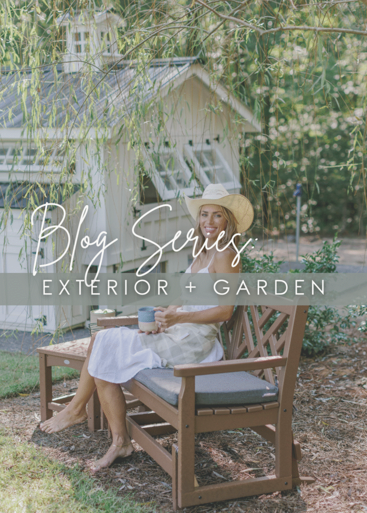
I’ve rounded up all my home content in one easy spot. Click HERE for the fulllll list of my home blogs OR you can check out a couple of my series below! Ya never know when our next big project will be.. (Neither does my husband and I prefer it that way..😉)

Keep everyone in the loop by sharing this post:
Leave a Reply Cancel reply
Design by Raise Your Words Design. Photography by Brynn Gross Photography. Designed with Showit.
Terms & Conditions
Privacy Policy
Drop a comment & let me know what you think!