Best Sherwin-Williams Paint Colors for Your Home
If there’s one question I get on repeat, it’s about paint colors. Whether it’s the lake house, our primary home, or a specific room reveal, you always want the exact shade.
So instead of sending individual links and breaking it down room by room, I wanted to put everything in one place. This is the simple, no-overwhelm version, just the Sherwin-Williams paint colors I love, where I’ve used them, and why they work.
White Paint Colors I Always Come Back To
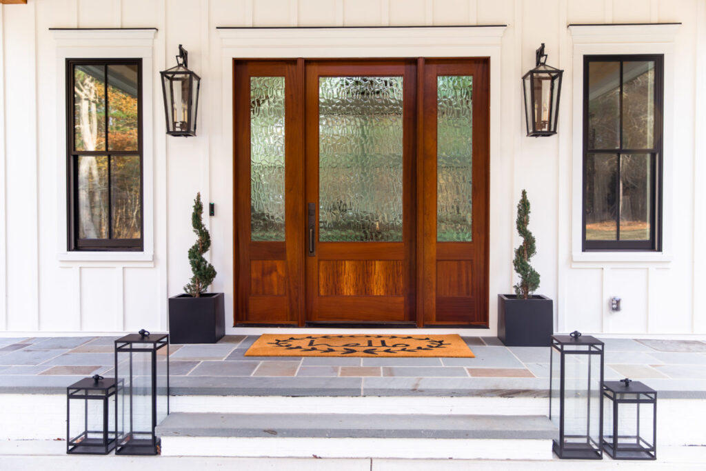
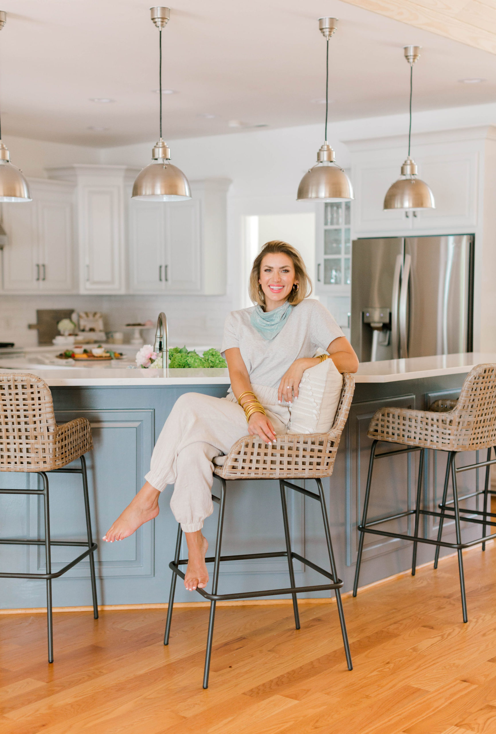
I searched high and low for the perfect white paint color and I found it in Alabaster.
Alabaster by Sherwin-Williams
Light, airy, and neutral = my favorite combination.
We used Alabaster on:
- The entire exterior
- All interior walls (with the exception of a few which I’ll talk about more)
- All of the white trim
Since I love this color so much, I even had our Caroline Coops Chicken Coop and Bunny Bungalow painted in Alabaster! They are adorable because they match our house and look like their own little mini farmhouses.
Because it has warm undertones, it never feels sterile. Instead, it creates that welcoming, layered look I love.
If you’re looking for the best warm white paint color for walls, this one is truly a staple.
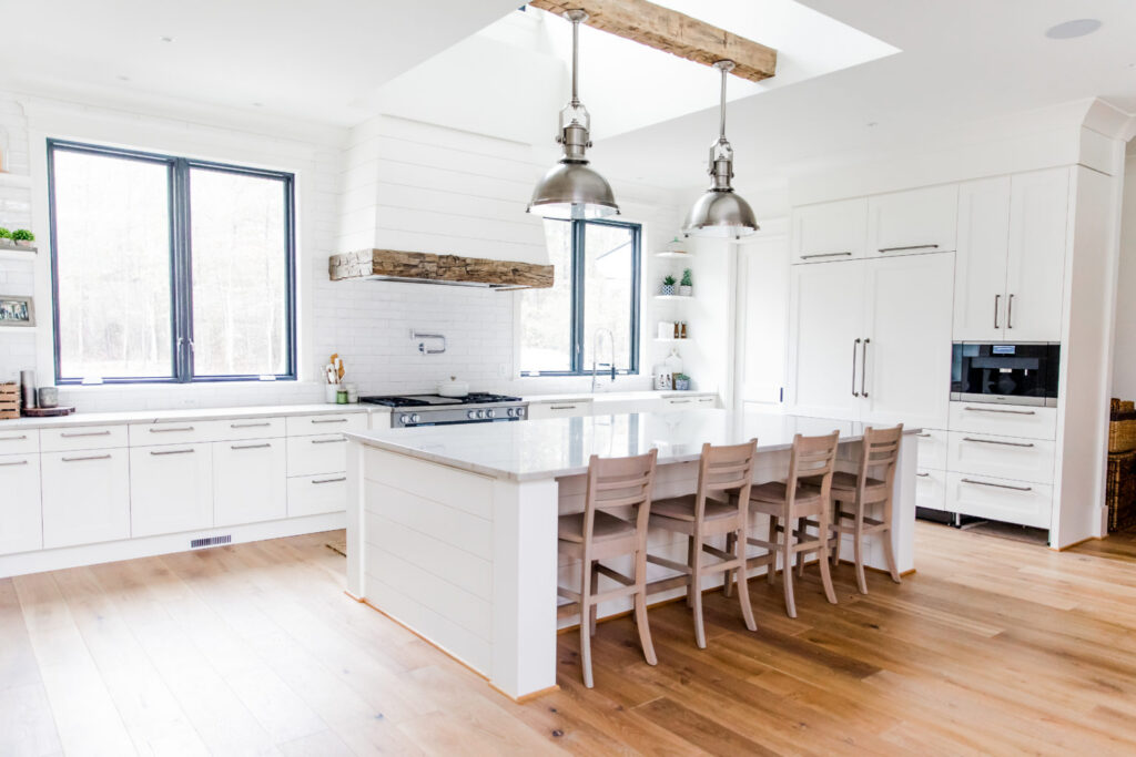
Trim, Ceiling & Finish Detail
Here’s exactly what we used for trim and finishes:
- Tricorn Black (satin finish): Interior black window trim
- Pure White (satin finish): Trim
- Pure White (flat finish): Ceilings
- Eggshell finish: Walls
Using different finishes makes a bigger difference than people realize. For example, satin on trim adds durability and subtle sheen, while flat ceilings soften overhead light.
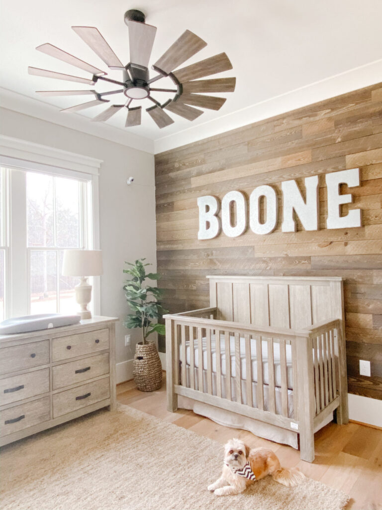
Boone’s Room – Repose Gray
The only other room in the house with a different wall color is Boone’s room. You can get the full tour of his room here!
I chose Repose Gray to complement the reclaimed wood accent wall. It keeps the neutral and fresh theme flowing throughout the house while still giving his space its own personality.
Plus, it’s such a versatile neutral paint color. It gives him room to change things up as he gets older (even though he’s staying my baby foreveeeeer).
If you’re searching for a soft gray for a boy’s bedroom that won’t feel trendy in five years, Repose Gray is such a safe, timeless option.
Green Paint Colors That Feel Calm & Cozy
Lately, I’ve been gravitating toward greens. They add depth while still feeling soft and livable. I also love the idea of bringing the outdoors inside and I think these green color accomplish just that!
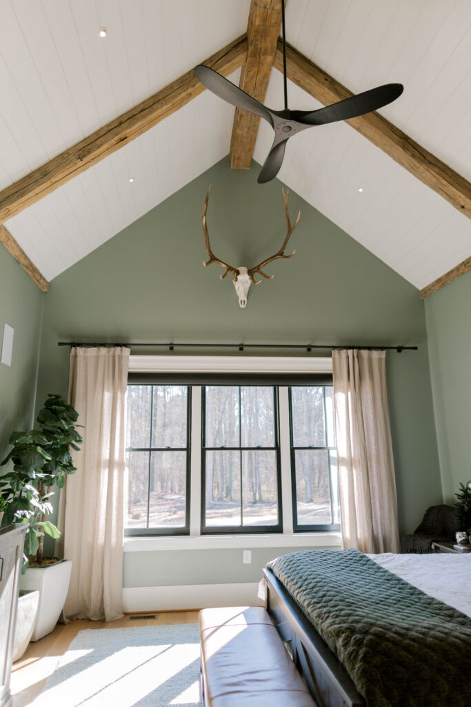
Evergreen Fog – Bedroom Walls
We used Evergreen Fog (SW) in our bedroom, and it instantly transformed the space. Because it has warm undertones, it feels cozy rather than dark.
In fact, it’s one of the best green bedroom paint colors if you want something moody but still serene.
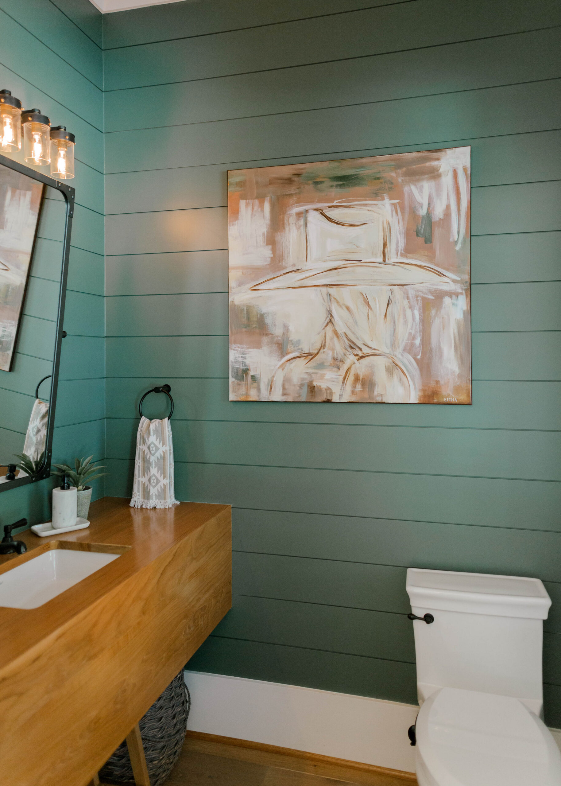
Succulent – Powder Room Moment
Powder rooms are such a fun place to take a small design risk. So, in ours, we chose Succulent (SW). It adds personality and richness, yet it still feels elevated and classic.
If you’re hesitant to try color, a powder room is the perfect place to start.
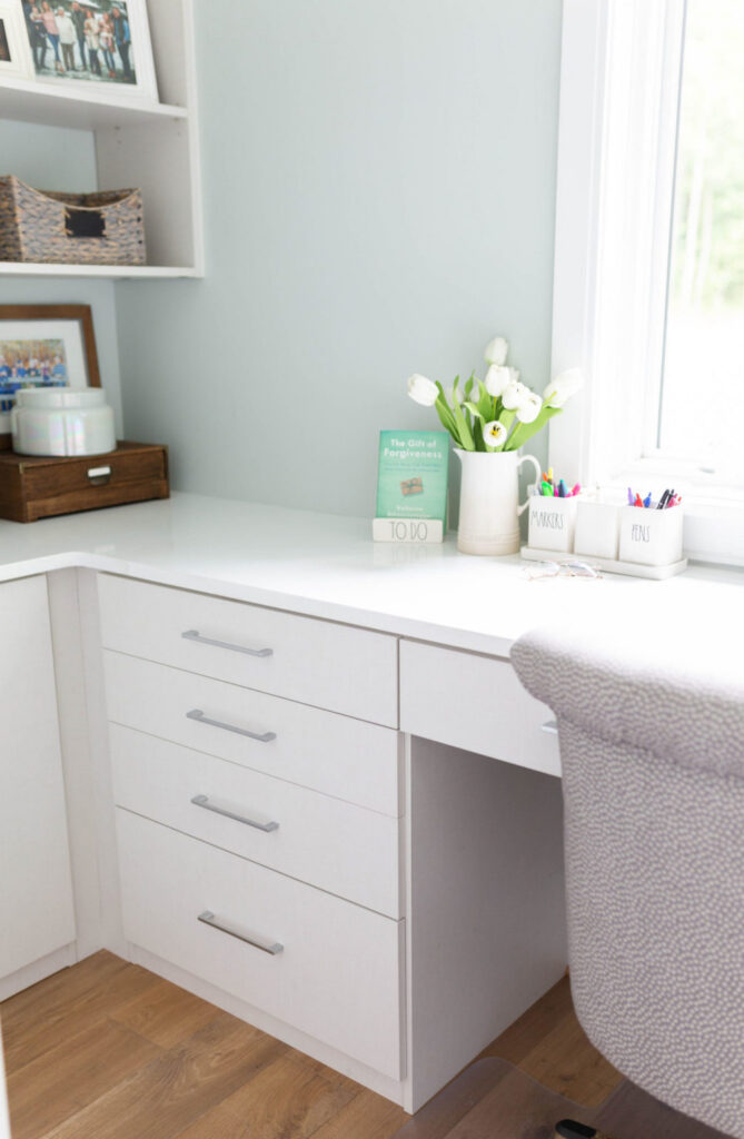
Sea Salt – My Office Sanctuary
My little office is my sanctuary, the space where I get to work on everything I’m passionate about. I wanted something different in here, so I chose Sea Salt by Sherwin-Williams.
It’s soft, subtle, and inspiring without being distracting and creates the perfect creative environment.
If you’re searching for calming office paint colors, Sea Salt is such a beautiful option.
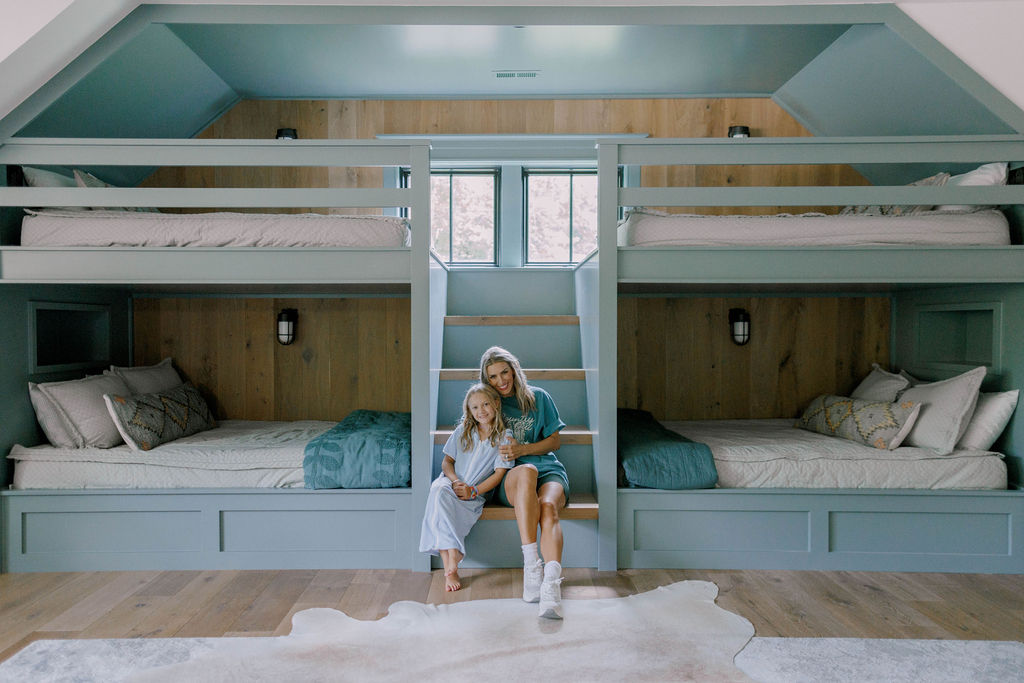
Portsmouth – The Perfect Bunk Room Blue
We used Portsmouth from Sherwin-Williams for the bunks in our bunk room, and I could not love it more. Not only does this color complement the flooring sssooo well, but it also adds personality without overwhelming the space.
Lake House Paint Colors
A few years ago, we bought a lake house and did a fulllll overhaul! It was such a fun project. Designing and flipping the lake house was such a dream because I could lean into that fresh, relaxed, modern farmhouse style but with a little edge. Some days I still get said that we flipped it, instead of keeping it, but it makes me so happy that another family can make some amazing lake memories there! If you want the full story on the lake house renovation, you can check it out here!
Kitchen Cabinet Paint Color – Gray Otter
For our lake house kitchen cabinets, I worked with Spectrum Paint to custom tweak the perfect off-white/gray.
We landed on Gray Otter (SP28) at -20%, and it was the perfect mix.
This shade has the softest blue/green undertones, which subtly complement the stainless steel appliances while tying in the pop of color on the bar top. With these paint colors, the kitchen feels cohesive rather than contrast-heavy.
If you’re searching for the best kitchen cabinet paint color that isn’t stark white but still feels light and neutral, this one is so beautiful.
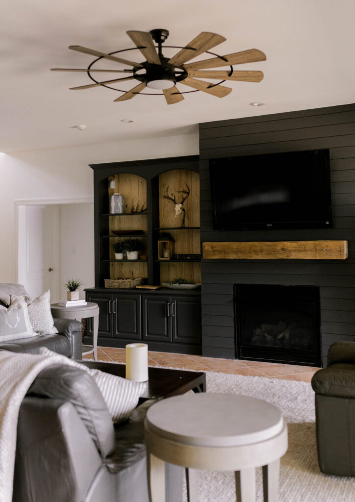
Moody Built-Ins – Mild Steel
Now… I went a little wild downstairs (for me anyway, haha).
Staying true to the modern farmhouse style (but with a little edge) I chose Mild Steel (SP43) for the built-in shelves and shiplap.
This muted black shade creates such a rustic and cozy atmosphere. Because it isn’t a harsh, true black, it brings warmth instead of feeling industrial.
If you love modern farmhouse paint colors but want depth and contrast, this is such a strong choice.
My Simple Paint Philosophy
Over the years, I’ve learned that timeless paint colors always win. Trends come and go; however, warm neutrals and classic blues and greens never feel dated.
Here’s what I always keep in mind:
- Start with a neutral base.
- Layer in color intentionally.
- Always test paint samples in your own light.
Because every home reflects light differently, sampling first saves so much regret later.
Ultimately, I want our homes to feel warm, welcoming, and lived-in…not trendy for the sake of being trendy. These are the Sherwin-Williams paint colors that have truly stood the test of time for us.
If you want more detail on specific spaces, you can also read my full Lake House Paint Color Tour and my Modern Farmhouse Paint Colors blog.
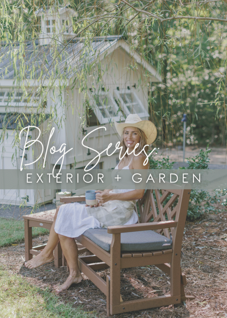
Want even more home design inspiration?
I’ve rounded up all my home content in one easy spot. Click HERE for the fulllll list of my home blogs OR you can check out a couple of my series below! Ya never know when our next big project will be.. (Neither does my husband and I prefer it that way..😉)


-2")
Drop a comment & let me know what you think!